New apps, products and websites are constantly battling for our attention. As of March 2022, there were 37 billion app downloads worldwide, and the unfortunate reality is that, while some will take off, and generate unbounded attention and interest, others will never attract a strong user base. With so much choice available to the market, there’s a clear formula that explains why some businesses have become more successful than others. It’s fair to say that a sound business idea is key. But good UX design is a secret weapon for pleasing your target audience, and keeping users’ attention on your product.
The principle underpinning UX design is simply putting the user at the heart of the design process. As straightforward as it sounds, businesses often miss the mark, and lose out on the opportunity for repeat customers. There’s an abundance of choice in the market, so, if users are displeased with their experience, they’ll simply look elsewhere.
Here are 5 examples of UX designs that businesses have aced in an effort to serve their users.
In this article:
- Apple’s product comparison page
- Netflix’s progress tracker
- Shazam’s simple app design
- TikTok’s attention-grabbing feed
- Spotify’s personalised data insights
1. Apple’s product comparison page
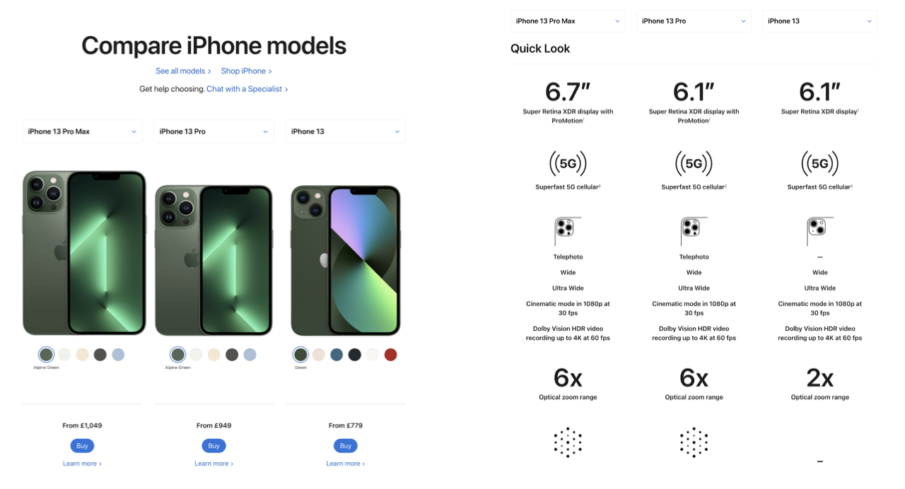
Apple has long been hailed as the business that has led the UX revolution. From the design of its user interfaces across its products, to its packaging, Apple has consistently adopted the ‘less is more’ approach, which is a formula that seems to be working as it became the first $1 trillion company in 2018 and the first $3 trillion company in 2022.
This example, taken from its website, is one small way that Apple prioritises its users’ experience. On the product comparison page, users can select up to three items, and compare them side-by-side. What makes this page more intuitive, is as you scroll down the page (see right image above), the product names move down the page with you. This saves users from continuously scrolling up and down the page. It’s a small feature but is a tool that is very handy for users with dexterity issues.
2. Netflix’s progress tracker
Without question, Netflix revolutionised the film industry by bringing high-profile films and sought-after series’ to consumers’ fingertips, on demand. There are two key UX features that Netflix is best known for. Notably, both of them are innovative examples of ensuring that the user stays engaged when using the service.

Of course, we’d be remiss if we didn’t mention Netflix’ autoplay feature. This feature ensures that users watch content for extended periods, by automatically playing the next episode without breaks or ads. But a similarly useful feature is Netflix’ take on the progress tracker. As shown in the image above, users can see how much of a programme or film they’ve watched when they visit their home screen. Progress trackers are a powerful UX tool because they tap into our human nature of wanting to accomplish a task or complete a goal, which encourages users to continue watching content.
3. Shazam’s simple app design


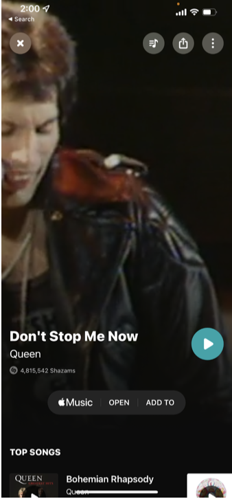
Shazam is one of the best examples of an app that directly solves a consumer problem. Most of us have had a moment where we hear a song but can’t remember the name of it. The purpose of this app, which was first developed in 1999, is to help users identify songs and tv shows by simply playing a sample of the audio.
As soon as you open the app, you’ll immediately notice its simple design. Users are presented with one button to start playing audio. The user is then told the name of the song within seconds, and offered ways to play or download it.
This process seamlessly adheres to Hick’s Law, a psychological principle stating that the more choices you present to users, the longer it’ll take them to reach a decision. As we’ve discussed, there are millions of apps, so helping users to complete their tasks efficiently will retain their attention. Shazam’s app design is a great example of how to do this.
4. TikTok’s attention-grabbing feed

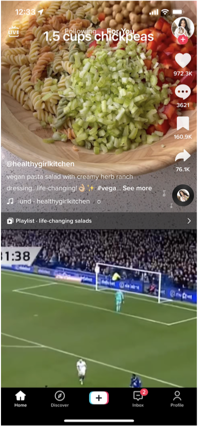
Despite its initial release in 2016, video-sharing app TikTok gained much of its popularity during the Covid-19 pandemic. By December 2021, it had surpassed both Google and Facebook to become the most popular web domain in the world. One of the biggest questions is exactly how it did this, and part of the answer lies in the app’s design.
TikTok’s main video feed (called its ‘For You’ page) compiles a stream of popular videos from all over the world. Unlike its competitors, TikTok has mastered the UX art of reducing cognitive load. You’re greeted with a highly-ranked video as soon as you open the app, which starts playing immediately. Users are then fed a continuous stream of videos without any breaks (see right image above), similarly to Netflix’s model.
In comparison, when users open apps like Instagram and Twitter, they’re inundated with elements like stories and buttons. By reducing these choices, users aren’t overwhelmed with options and can get straight into engaging with the content.
5. Spotify’s personalised data insights

(Source: Spotify)
Spotify has firmly positioned itself as the biggest global music streaming service, controlling just under a third of the market as of January 2022. As such a prominent company with more than 162 million subscribers, in most cases, it’s easy to become detached from users, however, Spotify has found a unique way to incorporate personalisation into its service offering.
Within UX, personalisation is a powerful technique that requires individualising a product or service to suit the needs and choices that each user makes. The idea is to create an experience that exclusively meets each user’s needs – research shows that 74% of online consumers feel annoyed when a website’s content isn’t tailored to them.
Spotify provides a tailored experience with its end-of-year ‘Wrapped’ statistics. At the end of each calendar year, Spotify rounds up all the data from the music and content each user has engaged with the most, and provides them with tailored insights, such as who their most loved artists of the year were, and their favourite genre. Something as small as harnessing their data to create individualised insights creates a relationship between the user and the service as more than just a tool for listening to music but also a way of understanding themselves better, while also generating public discussion around users comparing their stats.
Conclusion
UX design can be used in unlimited ways to delight users and foster stronger relationships with them. Ultimately, the better a user’s experience is with a product or service, the more likely they are to continue to use it, which is always beneficial for businesses.