
Some products just work, while others make you want to throw your phone across the room.
There are apps like Netflix and Spotify that remember the exact moment you paused an episode or a song.
Then there’s the video call app that logs you out two minutes before the most important meeting of the week.
Or the free trial that never makes it clear whether cancelling now will make you lose access immediately or not. And the moment you decide to go, the cancel button gets buried under a pile of offers trying to guilt you into staying.
That’s user experience (UX): how smoothly a product lets you get things done, and how well it handles the moments when things go wrong. A lot of it comes down to words: the buttons, error messages, form hints and empty screens that tell you what’s happening and what to do next. Designing those words is what a UX writer does.
In my 15+ years as one, I’ve seen one mistake behind most of these moments: designing for an imaginary user. Someone calm, patient, in a good mood, and already familiar with the product. Real people aren’t like that. They’re tired, late for work, rushing to pick up a kid with a fever, or opening the app for the very first time.
This article covers five moments where designing for that imaginary user backfires (and sends real ones to the competition), and how to design for the real ones instead.
Cracking a joke in a high-stakes moment
Every product breaks sometimes. The connection drops, a page won’t load, or the app just stops working. When it does, you have to tell the user, and that message is an error page. It’s also where a lot of teams like to show a little personality.
A friendly “Oops” or “Aw, Snap!” is cute the first time. But after 10 minutes typing in everyone’s passport details to book your family’s flights, it’s infuriating.
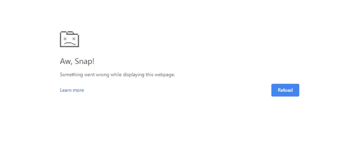
So is a funny error page always a bad idea? Not at all. Taco Bell’s has a taco that trips and spills the beans, and it works, because there’s not much on the line. The worst that can happen is you head back to the homepage to find the menu or your nearest restaurant.
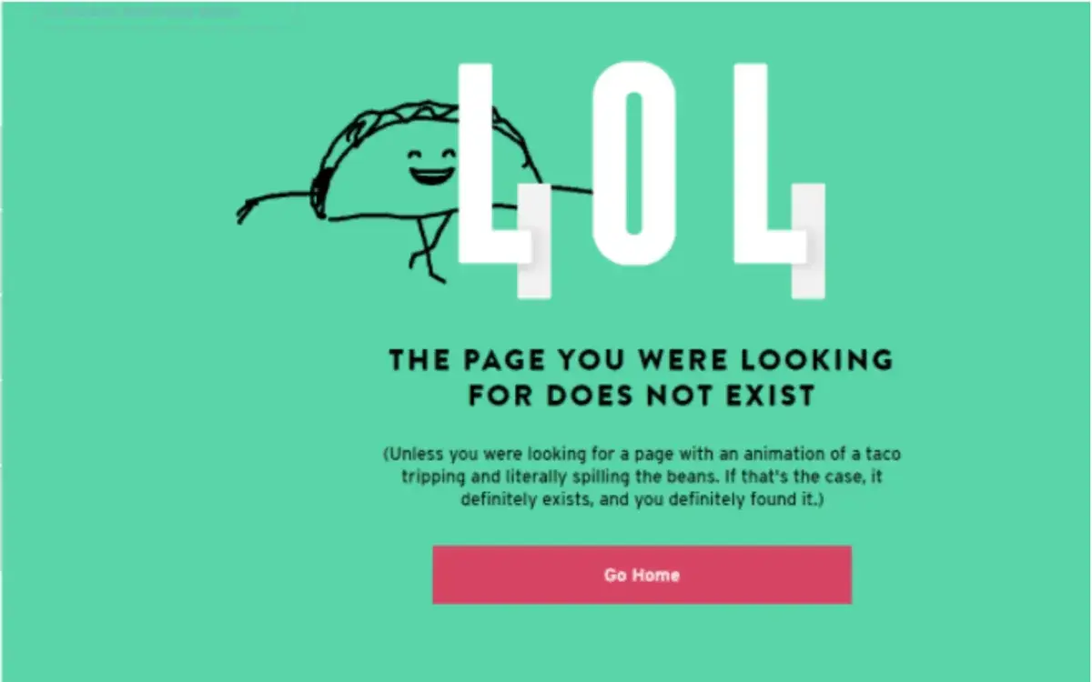
For most products, the stakes are higher. The same error can hit someone mid-payment, or halfway through opening a bank account. No one finds a wink and a mascot funny at that moment.
How to write a useful error page
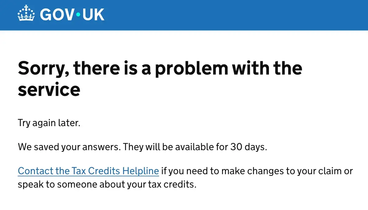
Before you write an error, picture where it could land at its most stressful. When the stakes are high:
- Drop the joke.
- Own the situation and say plainly what happened.
- Reassure the user. If their data is safe, this is the perfect moment to say so.
- Give a way forward: a retry button, a way to contact support, or where to go next.
Keeping users guessing
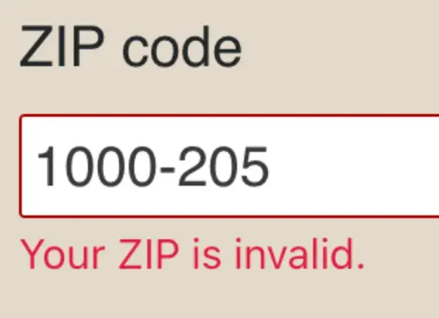
Fill in a form, get something wrong, and the field turns red with a short message. This is validation copy: the line that tells you the data you entered is in the wrong format. The job seems simple, but plenty of products get it wrong.
Telling people what’s wrong seems like the obvious move, and sometimes it is. If you mistype your email, “Enter a correct email address” is enough, because everyone knows what an email address looks like.
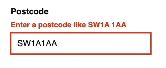
This approach falls apart when the format isn’t obvious. Take a postcode, a website address, or a phone number: there’s more than one way to write each. Does the postcode need a hyphen? Does the website need www. or http://? Why is your number wrong when you’ve checked it three times? The only way forward is to keep guessing or give up.
Show the solution, not just the problem
Good validation shows users the format you expect.
- Show the correct format using dummy data: “Enter a postcode like SW1A 1AA”, or “Use this format: www.example.com”.
- If there is a limit, show it. “Enter up to 20 characters” is more useful than “Password too long”.
Leaving users in the dark
It gets worse. Some validation messages don’t tell you what went wrong at all.
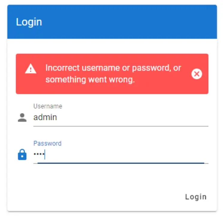
You submit a form and get a message saying something is wrong, but you have no idea what. It’s like a kid singing “I know something you don’t know.” Funny for a five-year-old, but infuriating when you’re trying to log in to your bank to pay the bills.

Put the error in context
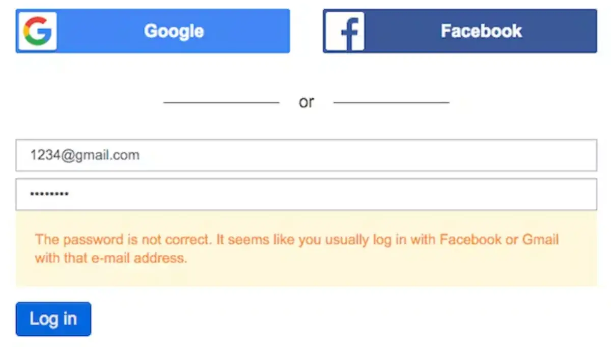
Show users where they went wrong, so they can fix the right field fast.
- Point to the exact field.
- Make it clear whether it’s their input or the system at fault.
Manipulating users into opting in
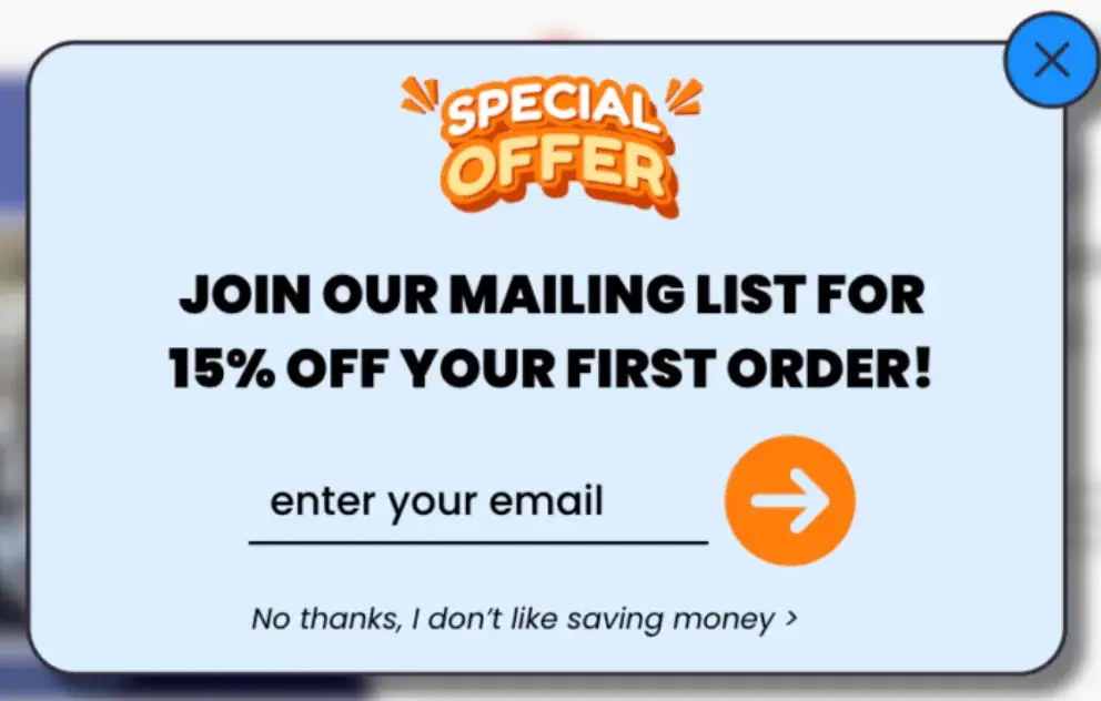
Every so often you’re browsing a website and a pop-up appears, offering a discount in exchange for your email. If you were about to buy something, that’s a nice bonus. But if you’re just looking, and the only way to close it is a button that makes you look stupid for saying no, that’s a completely different story.
This is confirmshaming: turning a simple no into a guilt trip. To decline an offer you never wanted, you have to click a button that makes you say something you don’t mean. It is built to shame you into signing up, but it mostly just puts you off the brand.

Let people say no without the guilt
A good opt-out is plain and neutral, and it takes no for an answer.
- Write the decline as a straight choice. “No thanks” is enough.
- Never put words in the user’s mouth or make them admit something untrue.
Underestimating empty states
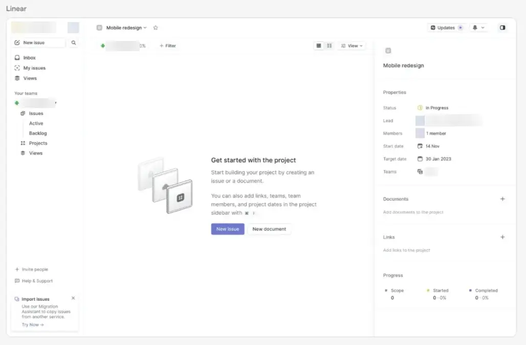
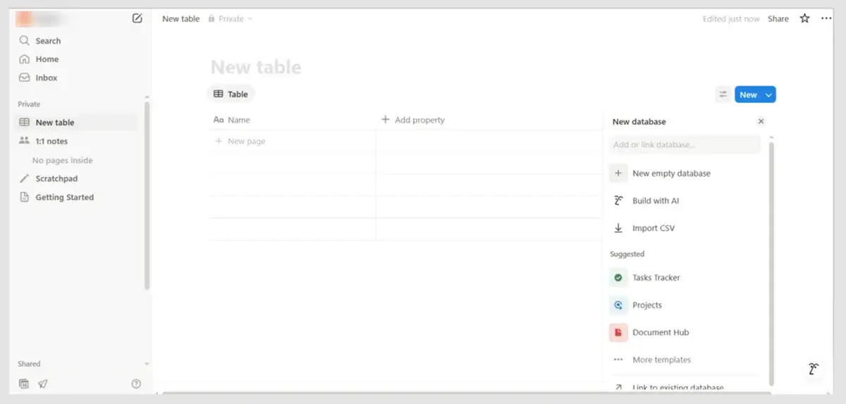
When you first sign up for an app, almost everything is empty. No messages, no tasks, no invoices. These are empty states: the screens you see when there’s nothing to show.
They’re often a new user’s first impression of the app, yet many products treat them as an afterthought. If those early moments are unhelpful, new users get stuck. If they’re done well, they guide the person into the app, make onboarding feel easy, and get them to keep using it.
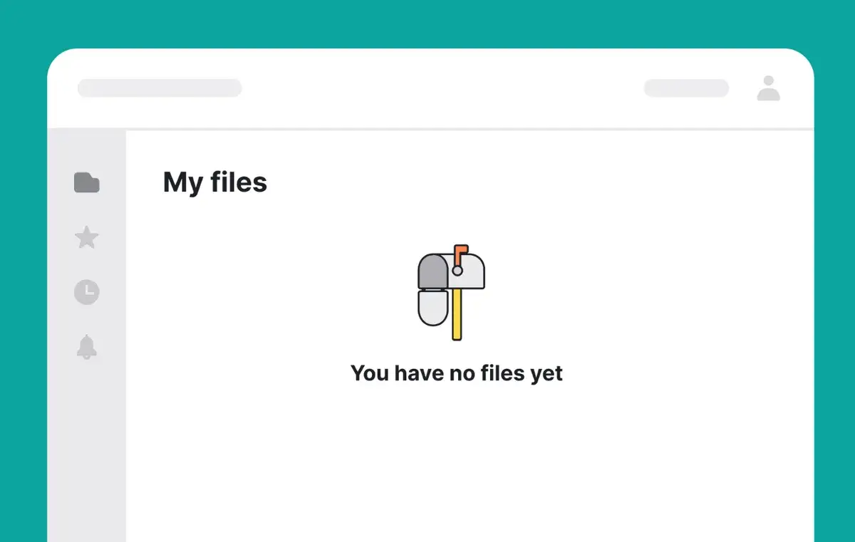
An empty state isn’t only about absence. Depending on the moment, the same blank screen can play very different roles:
- Celebratory, when someone has finished all their tasks.
- Introductory, when they’re opening a feature for the first time and need to know what it’s for.
- Instructional, when they can add or create something to fill the space themselves.
- Neutral, when there’s nothing to show and nothing they need to do right now.
- Explanatory, when they’re waiting for something that still isn’t there and need to know why.
Never leave users at a dead end
Empty states are more than blank screens. They’re an important part of the user’s journey, and a good one always gives people a way to move forward. Because empty states come in different types, there’s no single line that fits them all. So whenever you write one, think about:
- where the user is in their journey
- how much information they need
- how they feel in the moment (unsure what to do, or happy they’ve finished their tasks)
- what they can do next
These give you a basis for what to say and which action to point to, so the user can continue their journey in your app.
The imaginary user would chuckle at your error joke, guess the right postcode format on the second try, sign up rather than admit they hate saving money, and work out a blank screen on their own. Real users won’t. They get stuck, annoyed, and eventually go somewhere else.
Design for the person who’s tired, rushed, or brand new to your product, and most of these problems never happen. That’s what keeps people using your product, coming back, and choosing you over a competitor.