
Too often, having a great tone of voice gets confused with writing copy that simply stands out—words and phrases that strike us as clever, distinctive, or attention-grabbing.
But tone of voice isn’t just about how a brand sounds to itself. It’s about how that voice works for the user.
Like everything in marketing, tone of voice should focus on the audience first. At Essential Content, we believe that tone of voice is a function of user experience, not brand marketing. That’s why we’ve developed our tone of voice design service – to help complex organisations unpick values, goals, personality and unify them in a way that serves their users.
The right tone can help people find what they need faster, complete tasks more easily, and feel good about it all along the way.
Here are some concrete ways tone of voice can directly improve user experience.
1. Help users reach their goal—and go one step further
Tone of voice can function as a friendly guide that eases you through processes without having to stop to decode instructions or figure out what comes next.
Mailchimp’s introduction page on email campaigns is a great example of this. Simple, encouraging instructions break down the steps for sending a campaign into an easy, doable checklist.

But the page doesn’t end there either. Below it comes a prompt guiding you forward:

Altogether, the page gives you the sense that you’re not just ticking boxes but are learning as you go and getting better at creating advanced, effective marketing campaigns.
2. Make things easier to understand for everyone
Clear, accessible language helps you stay focused on what you came to do, without getting tripped up by jargon, confusing acronyms, or quirks with assistive technology.
GOV.UK, for example, decided to stop using abbreviations like “e.g.,” “etc.,” and “i.e.” back in 2016. These shortcuts can cause problems for screen readers, which might mispronounce them — saying “egg” instead of “e.g.,” and so on. Swapping them out for phrases like “for example” or “such as” makes the meaning clearer for everyone.
It’s also important to think about your audience’s reading level. The NHS Leicester website, for example, uses the term “ball sack.” While it might sound informal, it’s a term that many men readily understand, especially since the average reading level of NHS users is around a 14-year-old.
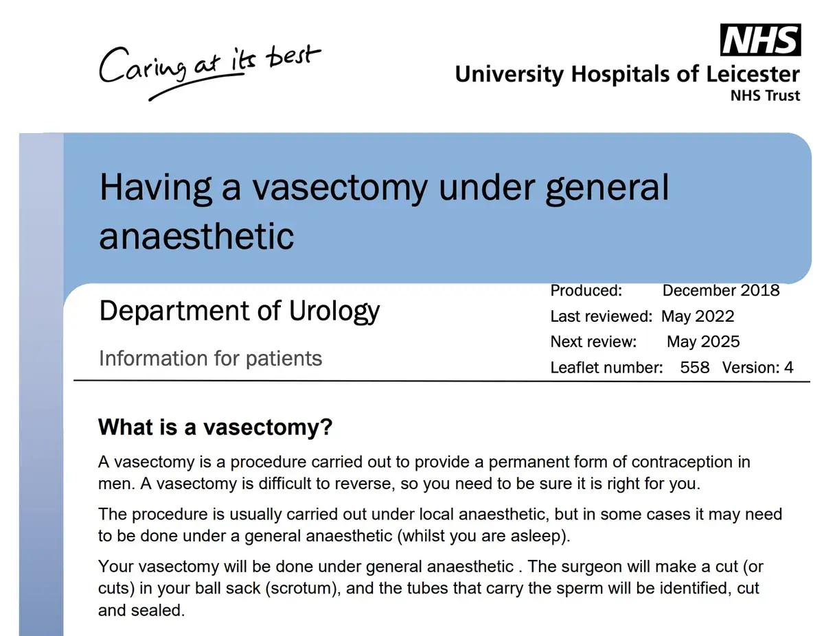
Using language that people are familiar with helps them connect with the information. They can move through the information more quickly and stay engaged longer too.
3. Ease recovery from mistakes
We’ve all run into error messages that let us know something’s gone wrong. Often though, these messages are cryptic. You might get a random code number, or just the word “error.” It’s frustrating, especially when you don’t know what went wrong or how to fix it.
Even worse are ‘cute’ “ooops!” error messages. We’ve written about them before.
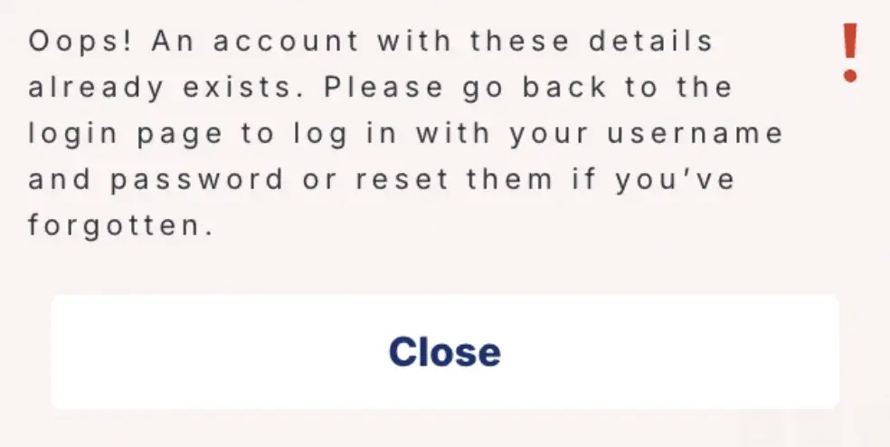
Worse still are ‘oops’ messages that come at a point in the journey flow where the user is necessarily struggling to complete a task. Above, we see an organisation ‘oopsing’ their way out of a problem when every data point on the back end will be telling them the user is struggling to access their account.
Spotify knows this pain point well. In fact, they’ve written a blog post on the art of the error message. Their advice: Make the message helpful and actionable. Don’t just say something’s wrong, but offer a clear next step.
For example, when users hit a firewall issue, Spotify doesn’t just give you a vague message like “Error connecting.” It explains what might be happening and how to move forward:
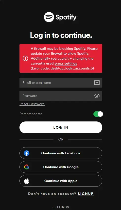
The tone you pick for your brand’s error messages can still have personality and flexibility— casual, formal, playful, or something else. Still, the goal stays the same: guide the user, helpfully and without blame.
4. Respect the reader—even in the fine print
Terms and conditions aren’t exactly known for being reader-friendly. Most of us see them, sigh, and scroll to the bottom.
Monzo shows us it doesn’t have to be this way. When they updated their current account agreement, they were transparent about the change: it had grown by 556 words—just a 13% increase. That honesty alone is refreshing.
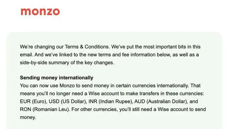
But the real surprise is that even with the update, their entire document is still a fraction of the size of some other banks’ terms, which can balloon past 30,000 words. That’s longer than Of Mice and Men.
Monzo writes so people can actually read their content without a law degree. Clear, well-written terms show users they’re being treated like humans, not liabilities. And that goes a long way towards building trust.
5. Reassure and reduce stress
Tone of voice can play a big role in moments where users are likely to feel uncertain or anxious, especially when they’re waiting for something to happen—a bill payment to go through, for example. That’s what John Sills calls the “invisibility gap”: the space between doing something online and seeing the result, where there’s no visible progress and users are left wondering.
That’s why this message from Vitality works so well. Instead of leaving users in the dark about their bill, it leads with clarity and reassurance:
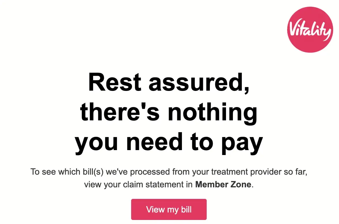
Vitality’s message doesn’t bury the lede or use technical terms. Instead, it immediately answers the question users are likely asking: Do I owe anything?
The follow-up line provides helpful context—what bills have been processed—and the call-to-action—“View my bill”—uses simple, human language. This kind of thoughtful message shows that tone is crucial for conveying empathy and usability.
6. Offer an enjoyable and memorable experience
Tone of voice can turn routine moments into ones people actually enjoy. Take this café finder from Oatly. Instead of just listing locations or returning a cold “no cafés nearby” message, the copy is warm, playful, and full of personality:
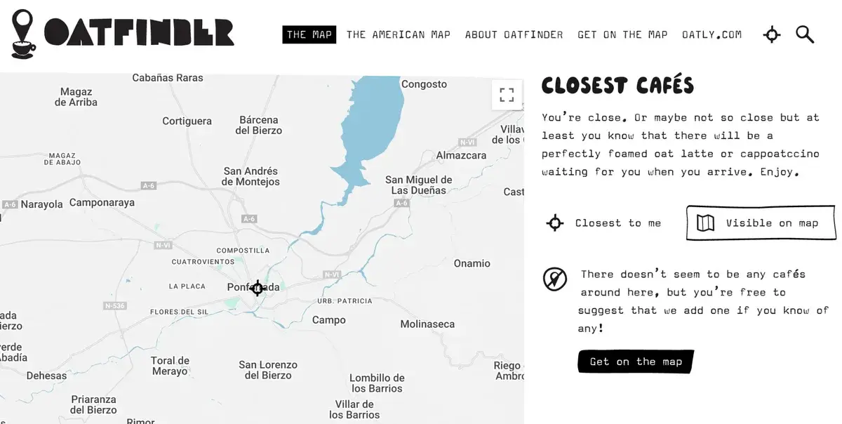
Even the fallback message keeps the mood light: “There doesn’t seem to be any cafés around here, but you’re free to suggest that we add one if you know of any!” Oatly’s tone makes a functional moment feel like a brand experience, where you’re having a bit of a conversation and interaction.
How to embed your tone of voice into your brand
Tone of voice includes how your brand sounds, but more importantly, it’s about how your product feels to use. Here’s how to build a tone that fits your brand and shows up in all the right places:
1. Clarify what you stand for. What are you actually selling? What makes it different? What do you want people to feel when they use your product? Nail down your brand’s point of view before getting into the nitty gritty of your tone.
2. Write first, define later. Don’t overthink it at the start. Just start writing. See what feels natural, what makes sense for your product, and how users respond. Once you’ve found a tone that works, then codify it into guidelines others can follow.
3. Design your tone of voice with intention. Of course, your tone of voice isn’t something that should live in one writer’s head. It needs to be designed, deliberately, with your whole team in mind. That means involving stakeholders early, aligning around goals, and thinking practically about implementation. At Essential Content, we call this tone of voice design: a structured process that results in real, usable tools your team can put into practice.
4. Workshop your voice with your team. As part of the process, try running a tone of voice workshop with your team. Gather your team and workshop it. Look at what you’ve already written. What sounds like you? What doesn’t? Define what’s in and what’s out. Agree on tone goals for different parts of the experience—support, product, errors, legal, etc.
5. Let your personality show everywhere. Tone of voice lives in the details, like error messages, onboarding, terms and conditions, and support pages. These “boring but important” moments are where trust is built (or lost). Prioritise them. Your tone of voice should show up in every interaction to build trust and makes the brand feel real.
6. Adapt your tone to the moment. Consistency doesn’t mean sameness. A playful tone can still be serious when it needs to be. Your tone should flex depending on context—calm and clear in error states, warm and encouraging in onboarding, and maybe bold or witty in marketing. Just stay rooted in your core voice.
7. Keep UX copy clear and human. Whatever tone you land on, your copy still needs to be useful. That means cutting fluff, avoiding jargon, and writing for real people. If you’re unsure what to leave out, our guide on what not to include in your UX copy can help.
Tone of voice isn’t a marketing flourish, but part of the foundation of your brand. And while a full tone of voice design process can help you embed it at scale, you don’t have to wait for that to start improving things.
If something about your voice isn’t quite working for your users, you can start small. Tweak a message. Rethink a sentence. Bit by bit, that’s how better experiences begin.